This past Saturday a handful of students, Dr. Rhine and I attended a tour at John Muir’s NICU in Walnut Creek, CA. This facility served as a strong contrast to what we have observed at Lucile Packard. John Muir is mainly single family rooms, with a few double rooms. When I entered the NICU, the first thing I noticed was how quiet it was. The spaces were much larger than LPCH, there was a central nurse area with several screens monitoring what was happening in every room. We were able to study some rooms that were not occupied, speak to the attending neonatologist Dr. Shilpa Patil and few nurses including Patricia Baird Hendrey RN. Below are some photos I took of design elements or “pain points” Nurse Patricia Baird Hendrey pointed out that I wanted to share with you. One over-arching theme as we walked through the facility was the lack of space for clinician’s personal items, and a separate, private work area. A simple locker room and clinician office space would solve this problem. It’s surprising how architects/interior designers seem to overlook the clinician’s needs.
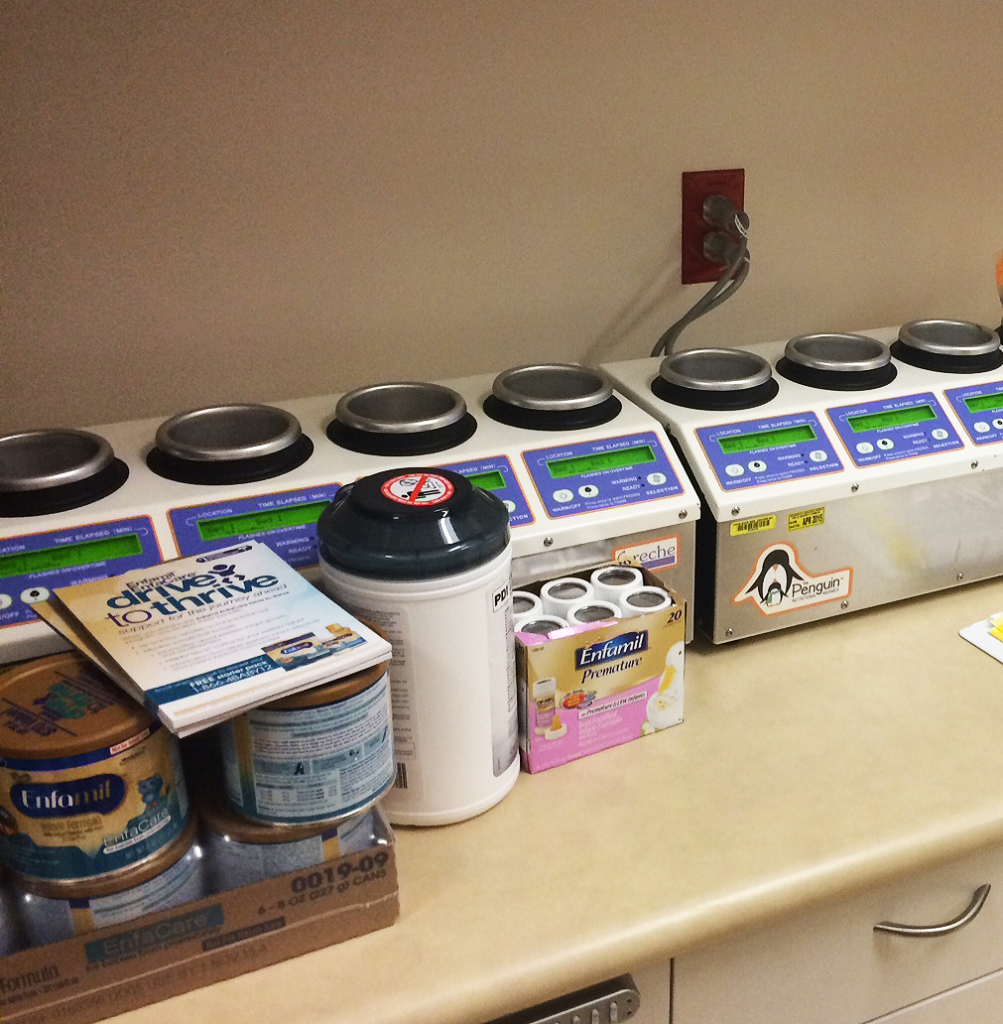
“Nutrition Room,” where milk is prepared.
This is an inventory dispenser for items that are add-on payment for patients. This system allows staff to stay on top of inventory and invoices the appropriate patient automatically.
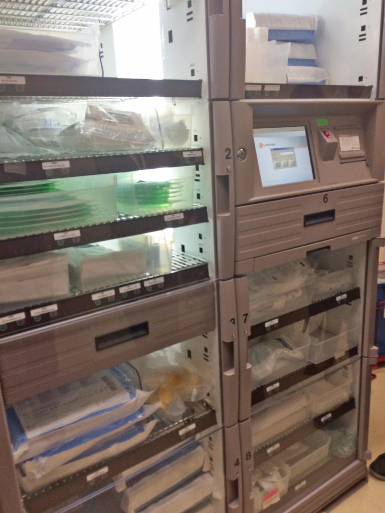
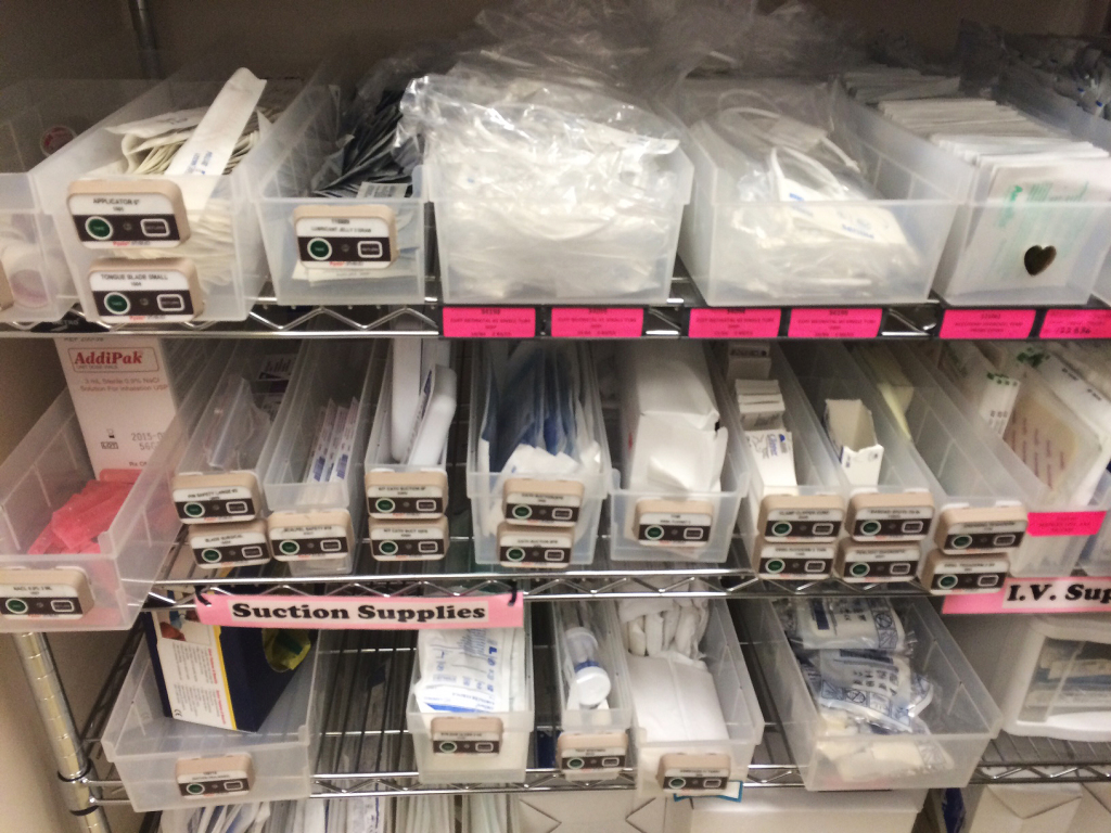
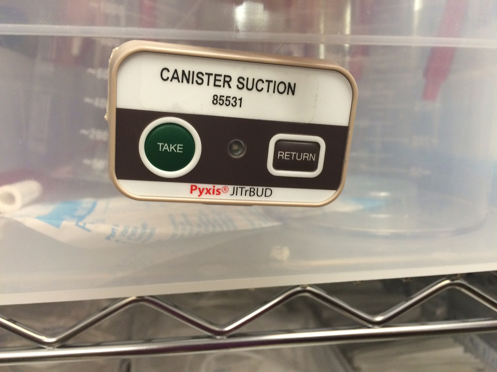
This is an inventory tracking system for standard patient supplies included in their stay. As you can see there is an electronic component that is stuck to the end of each plastic basket allowing clinicians to track when they take something out or put something back in.
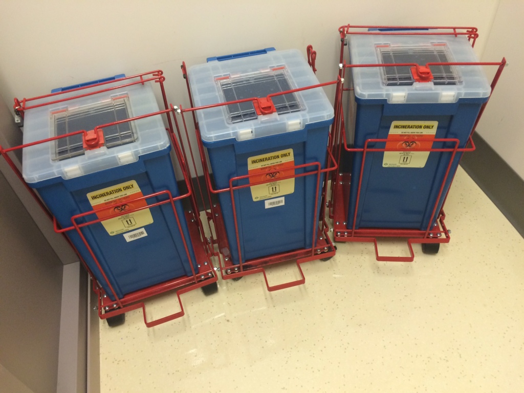 Incredibly ugly medication disposal cans.
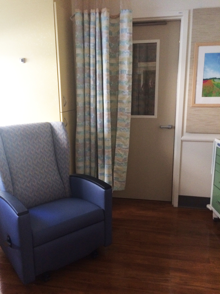
In most rooms there was a reclining chair that also rocked for Kangaroo Care. Also, as you can see, the single rooms are connected with doors that have windows so nurses can see through each unit, however, if the parent wants to close the curtain for privacy it is possible.
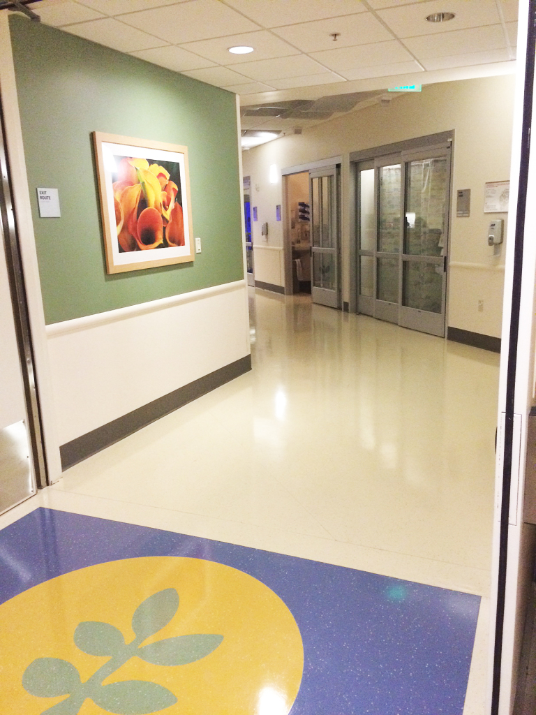
Brighter colors, artwork with a natural theme and decorative elements brighten the halls. Also notice the glass door system outside every room. The doors keep everything very quiet.
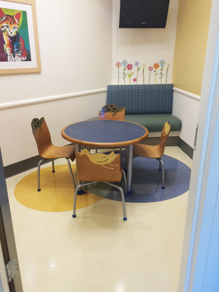
A sibling play-room just adjacent to the parent lounge room.
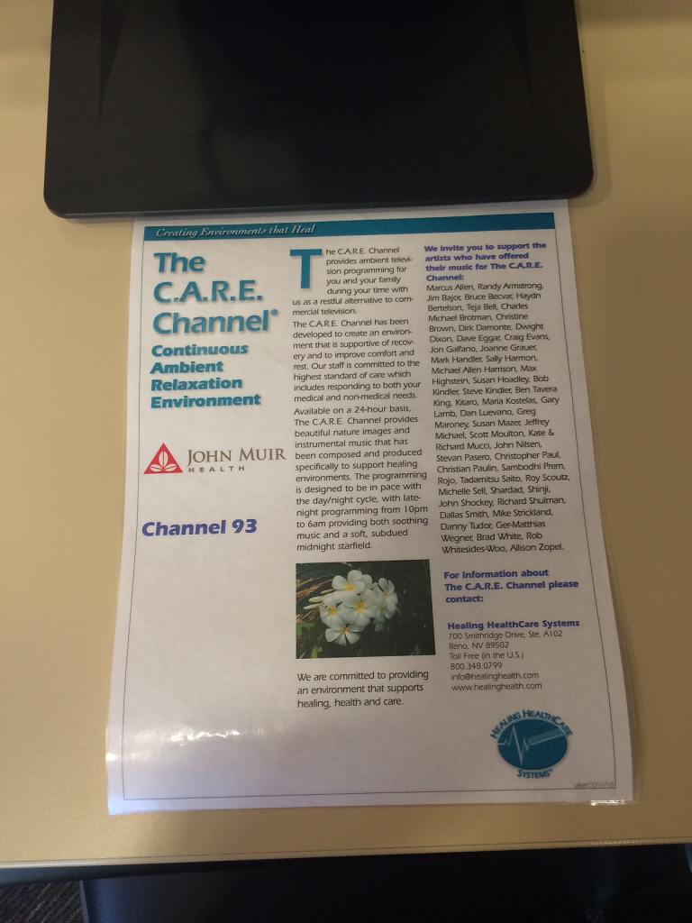
A station where parents can view relaxing video, or informational videos.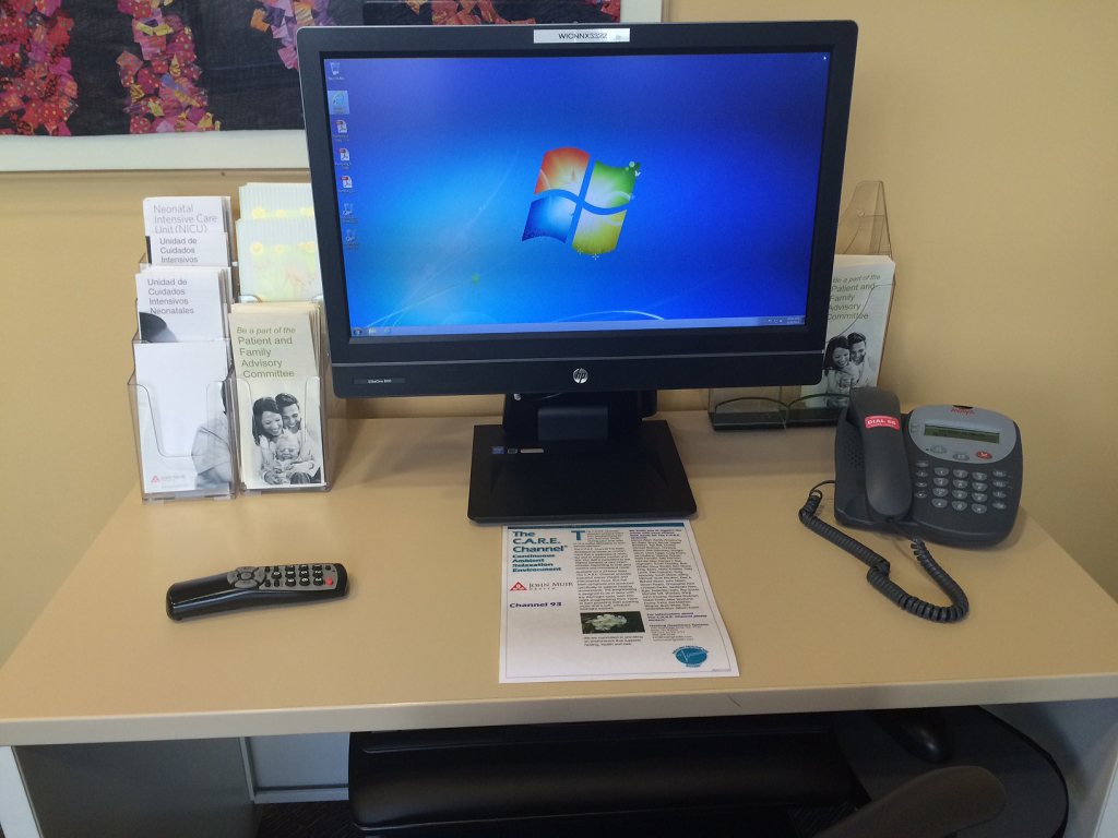
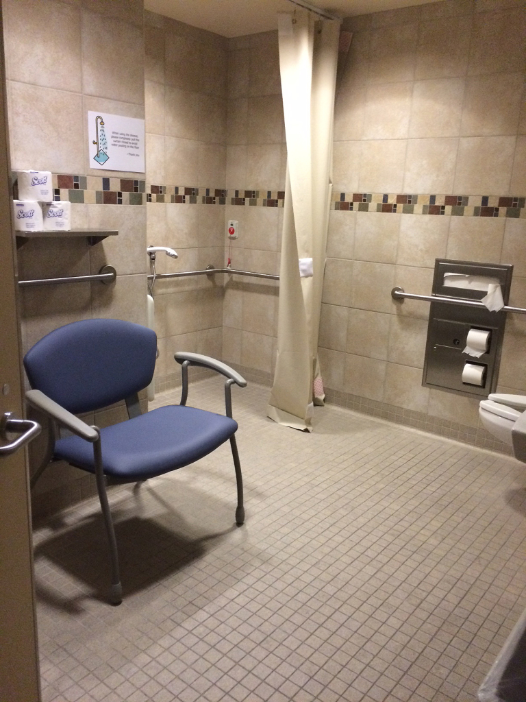
A parent-only bathroom/shower.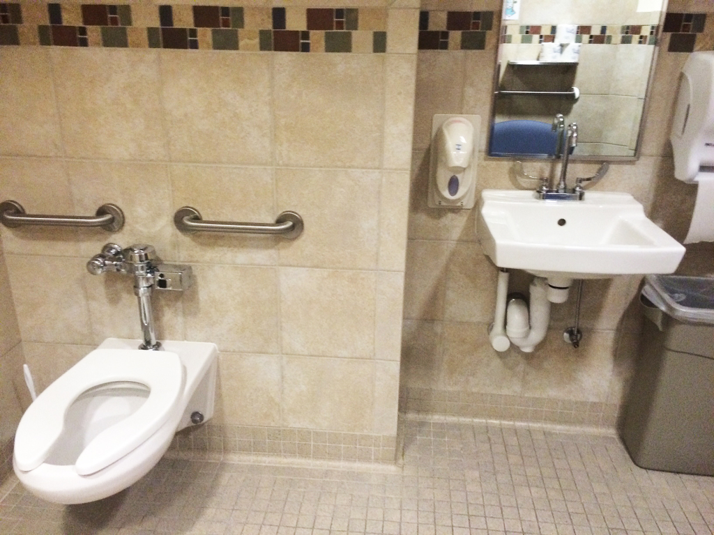
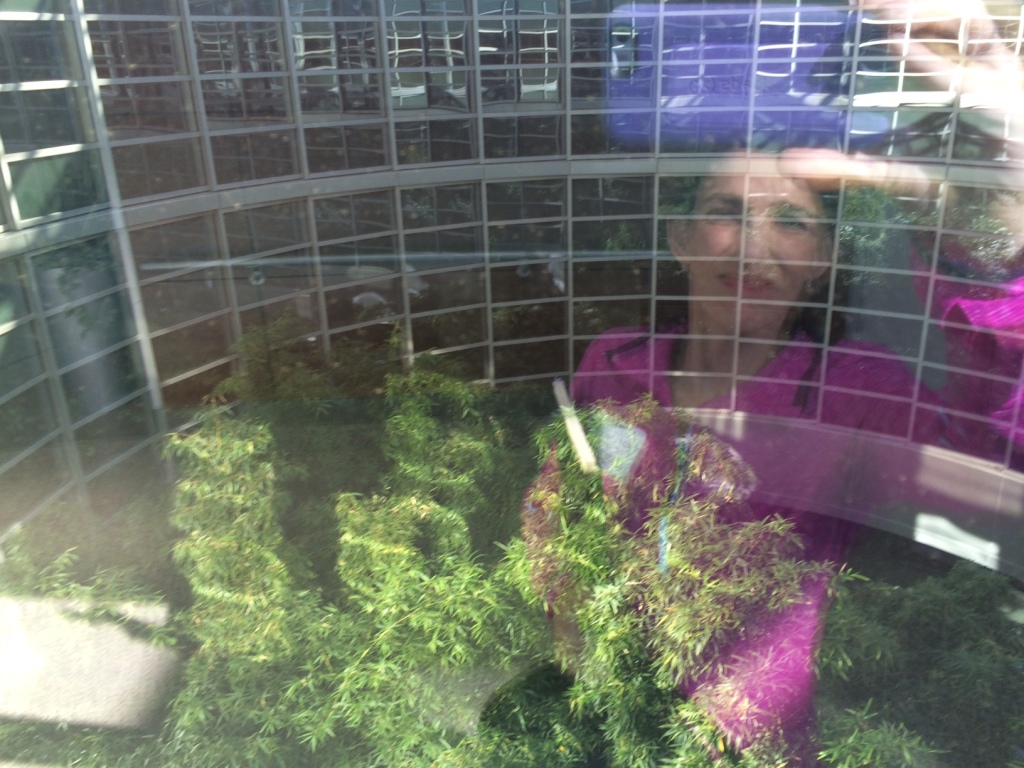
A beautiful interior green space with bamboo.
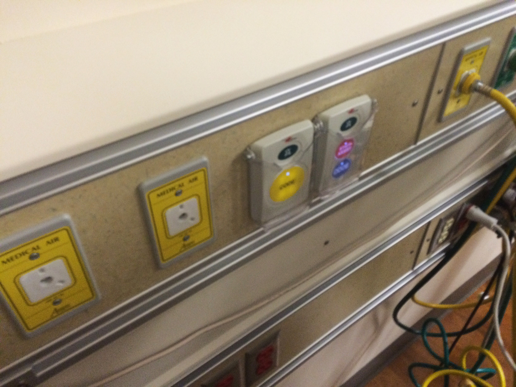 Emergency buttons in this NICU are located behind the isolette and peripheral equipment, and are difficult to get to for nurses. (These are the two beige button panels you see here on the wall). They have plastic covers to prevent accidental pushing.
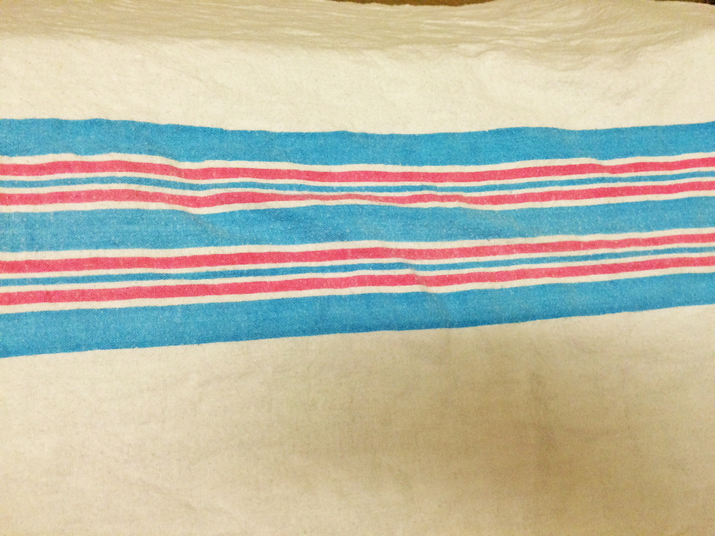
Oh yes, and how could I forget Standard Textile’s nauseatingly ugly receiving blankets all over the nursery. I checked their website and found one other alternative with a bunny pattern. (Who picks these colors and why?)
You can’t do any better Standard Textile?
Here, I’ll give you two ideas I found on iStockPhoto… (could be printed with any colors):
Special thanks to Nurse Particia Baird-Hendrey and Dr. Shilpa Patil for guiding us through the NICU and taking valuable time to explain the space, it’s virtues and challenges.


![wallpaper216-[Converted]](http://www.redesignhealthcare.org/wp-content/uploads/2014/11/wallpaper216-Converted.jpg)
